Change fonts themes and speed settings when the text feels wrong, not after you are already annoyed enough to quit. RSVP Reader gives you control over WPM, font size, fonts, themes, visual emphasis, spacing, and pause behavior. This help page walks through what to change first, what each control affects, and how to build a setup that fits the kind of reading you are doing right now.
Start with speed first
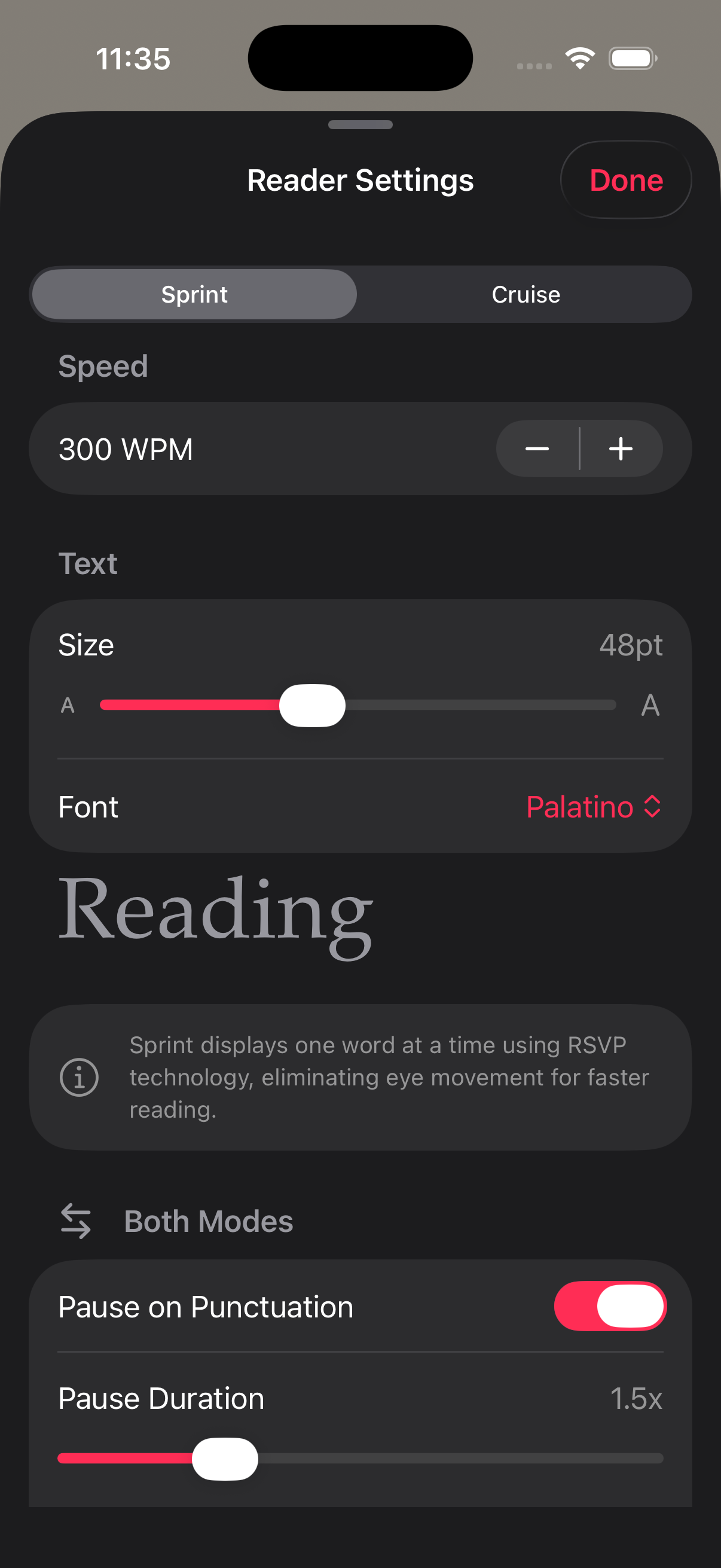
If the text feels rushed, change speed before you change anything else. Open the reading controls and lower the WPM until you can follow sentence structure without strain. If the text feels too slow, raise the WPM in small steps until the pace feels lively but still readable.
Here is why. Speed is the control you feel fastest. The RSVP Reader App Store listing describes a wide WPM range, but the right setting depends on the material. Short articles usually tolerate more pace than dense PDFs or long chapters.
Change fonts themes and speed in a practical order
When people change fonts themes and speed, they often jump around too much. Use this order instead.
First, set the pace. Second, set font size. Third, switch theme if the screen feels harsh or flat. Fourth, change font choice if the letter shapes are tiring. Fifth, adjust pause and emphasis controls if the session still feels off.
That order works because it moves from the biggest change to the smallest one.
Adjust font size
If the text feels cramped, increase font size. Apple Support shows the same logic at the system level in its guide on changing font size on iPhone. Bigger text can reduce strain fast. If the text now feels too slow or oversized, step it back slightly.
Use larger type for tired eyes, long sessions, and dense material. Use smaller type only when you want more text context on screen and it still feels comfortable.
Pick the theme that matches the room
Themes change comfort more than most people expect. In bright light, a lighter theme can feel clean. At night, that same screen can feel harsh. If the app looks too bright or too dim, change themes before blaming the content.
Next steps. Test each theme with the same paragraph for thirty seconds. Pick the one that disappears behind the text.
Choose the font that stays readable
If one font makes words feel muddy or crowded, switch to another. You are not looking for personality here. You are looking for a letter shape you can stay with. That is why the reader customization page treats fonts as reading controls, not decoration.
Use pauses when meaning starts to blur
If the text seems technically readable but still feels hard to follow, look at pause settings. Punctuation pauses can make fast reading feel steadier because commas and sentence endings get a bit more room. Apple’s spoken-content settings page is helpful here because it reminds people that rate is not the only timing control that matters. Small changes in delivery can make a big difference.
Match settings to the text type
Articles usually work with faster pace and lighter intervention. PDFs often need slower speed, more spacing, and stronger visual guidance. EPUB chapters can sit in the middle, depending on how narrative or technical they are. If you are changing fonts themes and speed for PDFs or books, pair this page with import PDF and EPUB files and read EPUBs faster on iPhone.
When to switch reading modes instead
Sometimes the right answer is not another setting tweak. It is a mode change. If the current view keeps fighting you, move to reading modes and pick the surface that better fits the material. If your eyes are tired, try listen mode.
Quick reset if your setup feels messy
If you changed too many things and lost the thread, reset your approach.
- Lower speed to a comfortable baseline.
- Set a medium font size.
- Pick the calmest theme.
- Turn punctuation pauses on.
- Read one paragraph and change only one control at a time.
That gets you back to a usable setup fast.
Sources
RSVP Reader: Speed Reading App | Apple App Store | April 1, 2026 | https://apps.apple.com/us/app/rsvp-reader-speed-reading/id6757968737 Change the font size on your iPhone, iPad, and iPod touch | Apple Support | August 22, 2023 | https://support.apple.com/en-us/102453 Adjust voice and speed for VoiceOver and Speak Screen on your iPhone, iPad, and iPod touch | Apple Support | February 15, 2024 | https://support.apple.com/en-us/111798